Setting up your card.
From a fresh install to a published vCard in under five minutes. Five decisions, one publish click.
01Pick a slug you'll be proud to print
Your slug is the part of the URL after your domain — yoursite.com/your-name. It shows up in QR scans, NFC taps, and email signatures, so make it readable and memorable. Lowercase, hyphenated, ideally your name or initials.
You can change it later, but old links break — nobody you've already given a card to will get redirected. Pick once, well.
jane-doe is taken, the form suggests jane-doe-2. We recommend something more distinct, like adding a middle initial or your company.
02Add your photo and branding
Three image inputs do most of the visual work:
- Profile photo. Square, at least 400×400px. Faces convert dramatically better than logos for individual cards — use a real headshot.
- Banner image. Wide aspect (3:1 or wider), 1200px+ across. This is the band behind your name. A muted brand background tends to outperform busy stock photography.
- QR logo overlay. Optional. A small mark inside your QR code; useful when the QR is printed alongside other brands.
The two color pickers — primary and secondary — drive every accent on your card. Primary is the page background; secondary is the action color (buttons, links, highlights). Pick a high-contrast pair.
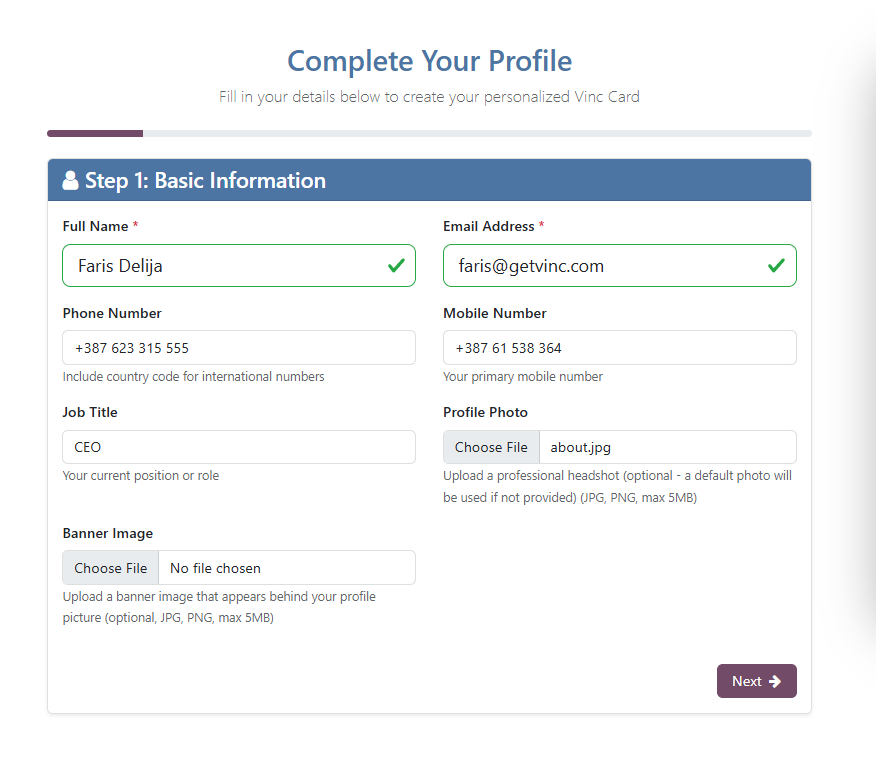
03Fill the contact details that matter
You can fill every field, but you don't need to. The fields that get used:
- Name, role, company. Always shown.
- Mobile. Tap-to-call works on phones — most card scans happen on phones.
- Email. Tap-to-mail.
- One website. Your company URL. Not five.
- One or two social links. LinkedIn for B2B, Instagram for B2C, Calendly if you want bookings. Pick the two people will actually click.
Resist the temptation to add every social network you've ever joined. A card with two clear actions converts better than a card with twelve.
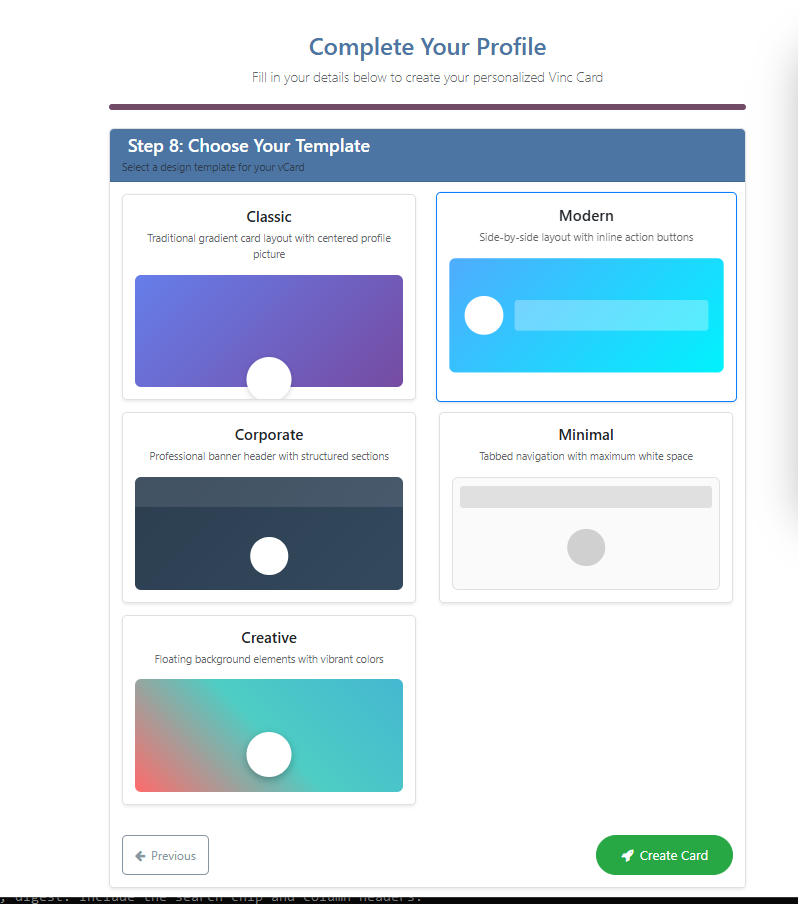
04Choose a template
Branded ships with five layout templates. They differ in how prominent the photo, banner, and lead form are — not in what data they show. Switch templates anytime; your data is preserved.
- Modern (default) — balanced layout with banner, profile photo, and prominent lead CTA. The safe pick if you're unsure.
- Classic — photo-forward, traditional vCard feel. Best for people-first cards (consultants, agents, founders).
- Minimal — pared down to name, role, and contact methods. For cards going on densely-printed materials where the QR carries most of the design.
- Corporate — banner-led, company-forward. Best for cards where the brand outweighs the individual.
- Creative — color-led, photography-heavy. For brands with strong visual identity (designers, agencies, hospitality).
05Publish, preview, share
The right side of the form shows a live preview as you type. When you're happy, hit Submit. Branded creates a real Odoo website.page at your slug — visit it directly, share the URL, or download your QR.
From your card's form view in the backend, the Publish / Unpublish smart button toggles whether the page is live. Backend edits to any visible field auto-regenerate the published page — you don't need to click "Generate" again.
Next: how to actually distribute your card so the work pays off.